Gorath
- Jul 20, 2019
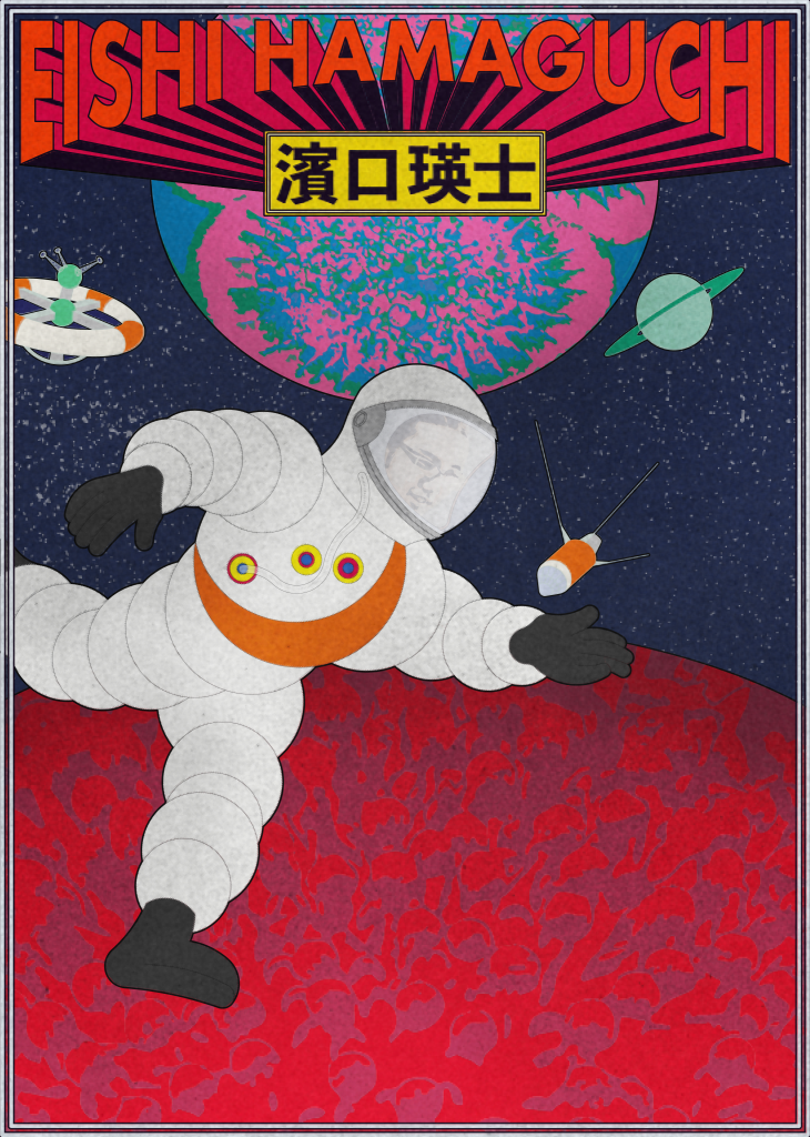
While digging through some archived files and I came across a poster I designed to promote the video we made for Eishi Hamaguchi. Originally, the plan was to post it on a few social media platforms. We had a notion to start a personal project called “Crowded Tokyo” that got sidelined by client projects. The concept was to profile a variety of Tokyoites and create a Showa-era movie poster for each profile. Eishi’s poster was based on the poster for “Gorath”. I remember some parts of making the poster that were fun. First, the textures of the planets are actually based on photos of petri dishes of fungus (I think one was black mold). Second, I took the chance while making this poster to study traditional Japanese colors. This is an amazing resource if you want to avoid getting sucked into the black hole of the Pantone catalog – it’s extensive and you can pick out so many different flavor combinations, but it’s still curated enough that you won’t be sifting through RGB numbers the whole day. Third, the Michelin Man, although originally based on a stack of tires, looks a lot like a space suit.
Next post:
ProductivityPrevious post:
Business Cards